Improving any UI with 10 usability heuristics

In 1994, Jakob Nielsen (the “guru of Web page usability” according to the New York Times) provided us with ten great heuristics to help us create easy-to-use interfaces, whether for the World Wide Web, for mobile apps, for a washing machine or for cars. His general principles are helping designers, developers and engineers alike to create products that are a joy to use. Even today, more than 25 years later, these “general rules of thumb” can still be applied to almost every user interface we stumble upon in our busy lives.
Creating new applications and products has never been easier. Augmented-reality glasses, meditation apps, video on demand services, the list is endless. But understanding the user and his or her exact needs is never easy. The basics however can be applied to almost every interface that exists.
 The “UI” of a washing machine. Photo by chrissie kremer on Unsplash
Heuristic 1: “Always communicate the current status.”
I think we all experienced this in one way or another — the current status of an object, a device or system is not always communicated properly.
When interacting with technology, users always work towards one goal: understanding the current status of a system and then figuring out how to change it. These two challenges have already been described in 1986 in the book “User Entered System Design”.
 Bluetooth UI example in a car. Photo by GMax Studios on Unsplash
To reach the goal of changing a systems status, users have to go through multiple subtasks:
- The user has to perceive the status correctly.
Example: Switching on a bluetooth speaker can lead to three different initial states — a device is connected to the speaker or not. Or the battery is empty and needs to be recharged. - The user needs to interpret the meaning of the perceived stimuli.
Example: A bluetooth speaker can produce a sound indicating that a device is connected or some LED lamps start flashing at short intervals to signal that there is currently no connection. - The user plans his next action based on his understanding.
Example: In our bluetooth speaker scenario, the user will now think about how he can connect a device or how to start playing music. This thought process may take milliseconds for experienced users, and seconds for newbies. Nonetheless, this step is important and should not be underestimated. To create a fulfilling user experience, all four subtasks of this goal-changing process need to be successful. - The user now actively starts manipulating the controls of the system.
Example: He proceeds pushing some buttons that enable a bluetooth connection. After a connection has been established, he may start playing music.
To create joyful experiences, some designers or researchers use “mental models”. Mental models are theories on how a system works based on the users beliefs. There are simple rules to follow if you want to create intuitive design elements. This includes creating visual and functional similarities to existing, familiar designs. A basic example: All cars use familiar interior designs to provide effortless usage.
Another example in tech: Almost all interfaces use an X inside the left or right corner to close an application. If a user can’t perceive this familiar symbol immediately, he gets confused and his actions get delayed.
Communicating useful information about the system also creates trust. It is the same way a real-life relationship works. Predictability of interaction creates trust as well.
In summary: Many designs in tech fail because they do not provide enough cues of its current system status and how to change it. Splitting a task into the four aforementioned subtasks can point designers to the right direction and help create a more user-centered design. The more information a system provides, the better the decision making of the user.
Heuristic 2: “Use the real world as an inspiration for your own user interface.”
Users carry their knowledge of the real world into the digital world. As already mentioned in the first heuristic, familiarity creates comfort. That is why the language of a website, for example, should match the language of its target audience. Using a language that your users speak also improves a website’s SEO (abbr. for “Search Engine Optimisation”).
 A backpack on the right bottom corner and compass in the top bottom corner in World of Warcraft, an online game from 2004. Image Source
Many examples of this heuristic can be found in games as well. A lot of UI elements are inspired by the physical world, such as maps to offer guidance or a compass for navigation. All of this can help lead to familiarity, comfort, and thus a great experience.
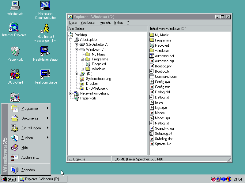
 Folder structure and symbols in Windows 95. Image source
Another great example are file structures in computers: A lot of user-friendly operating systems use folders as a visual representation of a collection of files and data. You create a folder called “My Vacation in Greece” and it resembles an album in real-life. There are many more similar use cases in operating systems to ease interaction with computers. A trash bin for deleted files where you can still rummage for lost treasures. Notepad apps with a yellowish paper background and handwritten fonts to resemble real notebooks.
Heuristic 3: “Let your user take control of his actions.”
Users make mistakes and want to try things out first without consequences. That is why they always want to be able to cancel an unwanted state. Leaving a purchase process in the middle of selecting a payment method and coming back to it later, or closing an application immediately without having to go through multiple dialogues and screens gives them the freedom they crave and need.
Especially in mobile apps and touchscreen devices, having an undo or cancel button is a necessity. Some really great features on touchscreen devices are hidden behind user manuals and googling and make them seem to be like some secret knowledge.
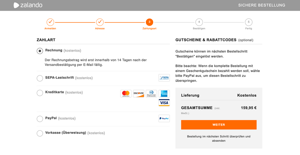
 This online shop visualises all of the different steps until the buying process is complete. Source: Zalando
Buying an item online for example almost always consists of multiple steps. Users want to go back and change items or an address, so make sure that these states are saved and can be changed even after they have already been saved.
If a user is confronted with endless dialogue screens or has to begin a tiring search for something as simple as an exit button, he will not want to come back again. However, if users know they can always go back or push an undo-button, they will not fear trying out new features and build trust and freedom with your application.
Many users also find joy in changing a system to match their own needs or personality. Being able to dye your twitter profile pink also creates a sense of individuality and freedom.
Here is an example that reduces feelings of freedom: Websites that take control over scrolling speed. I do not know of any user that is not getting confused or irritated by this design decision.
In summary: Always provide an emergency exit in your app or website as well as undo and redo buttons. Do not restrict a user in his actions and build freedom and trust with custom settings. Users make mistakes and they want to feel free to make them without consequences.
Heuristic 4: “Use familiar and easy to recognise patterns and symbols.”
As already mentioned before, humans love familiarity. It makes them feel good and provides comfort.
Not using familiar or standard design in tech can easily lead to increased learning curves, even resulting in higher development and product maintenance costs. Users that are confronted with unfamiliar UI elements get increased cognitive strain.
 There are a lot of different customization options at Material Design for an individual look, but they still provide enough familiarity. Source: Material Theming
In summary: If you are having trouble building UI elements, try to get inspiration from the real world. Some design languages that are already available in the web are ready to use and create familiarity because of their “default” look and feel (Material Design by Google, which can also be customised, Ant Design, Grommet, Semantic UI as an integration for React and many more). They can also be used for inspirational purposes.
Heuristic 5: “Eliminate user errors and prevent them from occuring at all.”
This rule is all about error prevention. If you feel the need to put hints into your application to prevent errors, why not try making your application as intuitive as possible so that errors won’t appear in the first place?
In the book “The Design of Everyday Things”, Don Norman explains that there are two types of errors: Slips and Mistakes. Slips are somewhat minor; they are made when users rush through an application and don’t want to spend time thinking about their actions much. A typo counts as a slip, or clicking the wrong button is a slip as well.
You can prevent these unconscious slips with a lot of helpful guidelines. For instance, you should choose good defaults. A default is something that is already there; the user doesn’t need to create it. A great example for this are input fields and form submissions: If you provide good examples in input fields, you can prevent typos and make suggestions on how to use the form correctly. You can also make suggestions, based on what users pick the most. A snooze button in an alarm app on a mobile device might provide a default of 5 minutes.
Mistakes, on the other hand, are something else. Mistakes happen when there is not enough helpful information to accomplish a specific goal. Users form incorrect action plans and their interpretation of the system does not match the mental model of the designer or engineer. To prevent a mistake, your mental model should represent your users expectations. Users don’t want to bother about learning a difficult mental model. They rather navigate to a different website.
In order to discover what your user expects, you need to gather data on how they act with your system. There are many research methods (eye tracking, user interviews, user journeys, usability testings, just to name a few) that can suit many environments, circumstances and budgets. You only need a visual prototype to work with.
In summary: Errors can be categorised in slips and mistakes. Slips can be prevented if you provide good defaults, confirmation dialogs (carefully though, because they do interrupt a user’s workflow), supporting an undo and redo function. Mistakes on the other hand need to be addressed with user research and data gathering to provide matching mental models.
Heuristic 6: “Make all information visible and do not hide it behind icons or boxes.”
A nice example for this are icons. Some icons, such as the famous burger menu icon, became a standard and are familiar to most users (not all of them, though, that is why burger menus became unpopular again). If your website or application has certain functions that hide behind icons you handpicked and added, there is no guarantee that users understand what they mean.
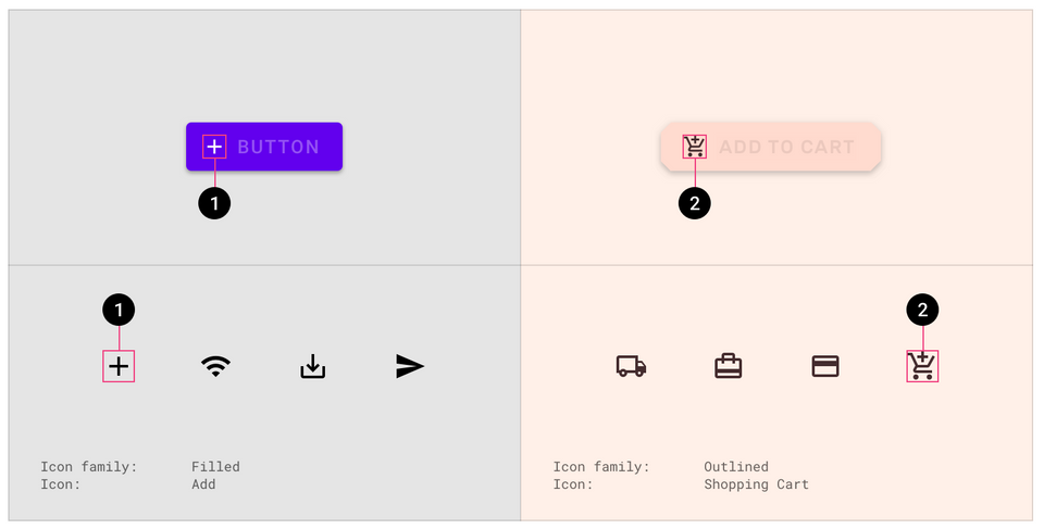
Provide your icons with text. This minimizes the user’s memory load. He won’t have to remember what this icon means and can move freely in your application without too much cognitive stress.
![]() Icons with and without text. Which example is faster to scan?
Icons with and without text. Which example is faster to scan?
A lot of games, mobile apps and complicated websites start with tutorials. Tutorials contain a lot of theoretical information at once. These will be hard to remember. Instead of handing out a tutorial, use hints and tips at the right moment or intuitive clues such as suggestions and good defaults. Users prefer to learn by doing something and don’t want to spend time watching a five minute video tutorial on how to use a website.
In some games, controls are displayed directly on the screen when they are needed. Users then do not have to recall them from their memory or look them up in a manual.
 Witcher 3 displays its controls on-screen while playing the game (see bottom right corner). Image source
There are many other tools that are broadly used by different websites and applications to help users save information. Amazon for example uses wish lists.
In summary: Don’t hide useful information behind icons, help your users remember by providing useful tools. Try to avoid long tutorials and use intuitive clues to ease memory retrieval.
Heuristic 7: “Give expert users more configuration options to accelerate their own experience.”
Allow your experienced users to tailor their actions. By doing this, you can improve efficiency drastically. You can, for example, provide hot keys and complex configuration settings for advanced users.
Some online shops provide a “Buy immediately” or “Go directly to checkout” function for users who shop a lot to increase efficiency.
Heuristic 8: “Keep your design aesthetic, but simple and minimalistic.”
People live in an era where information overload is becoming a serious problem. Reduce irrelevant information, and invest your time in learning effective UX writing skills. If you keep your UI precise and your words clear, your audience will have a better experience overall.
Heuristic 9: “Error messages should provide a solution.”
If a screen ends up with an error message, express the problem in plain language and suggest a solution. Don’t use numbers or codes and always offer advice on how to fix the problem or how to proceed.
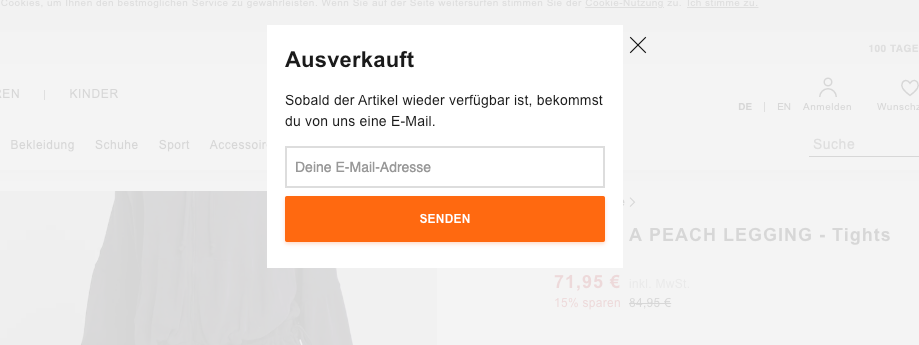
For example, if an item is currently out of stock, you can offer users to be notified via e-mail.
 Zalando provides an e-mail notification dialogue if a product or size is sold out. Image source
Heuristic 10: “Provide help and documentation for novice users.”
There are systems that work without a documentation, but some are complex and want to be operated by a broad variety of users. A common rule of thumb about documentations is: People won’t read them, except when they’re in trouble.
You can provide your error messages with a link that leads them to the correct part in the documentation. You should also provide an intelligent search so that users don’t have to browse through the whole documentation to find a solution to their problem.
Another new trend are chat bots. Many websites provide a chat bot, disguised as a human, that replies to common questions or problems and offers immediate help.
